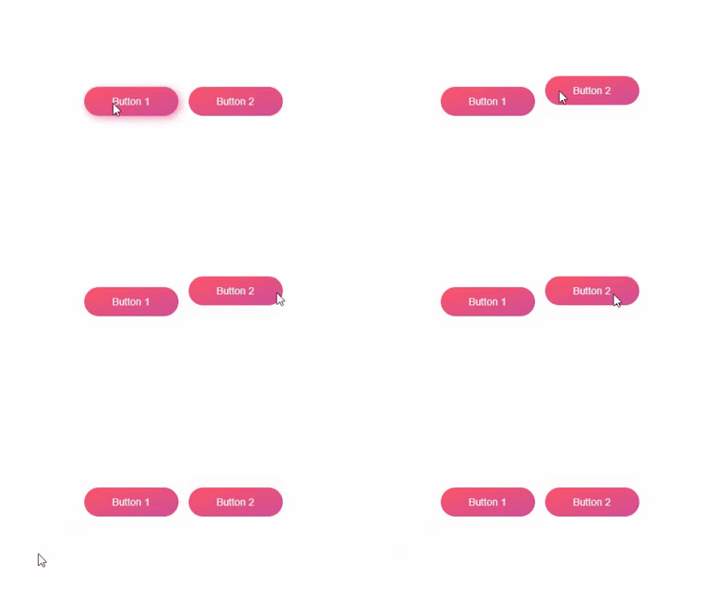
ANIMATED HOVER EFFECT BUTTON USING HTML & CSS
In CSS, you can create keyframes and use them for animations on different elements of your Web pages, including buttons. Keyframes consist of a single, reusable animation with properties set at various points. When the same property changes a little at each point, it creates a smooth animation. Using this, you can set the position of a button at each keyframe point to create a bouncing effect. This trick does not require any JavaScript or other coding, provided that the visitor of the site is using a browser that supports keyframes.
What are CSS Animations?
An animation lets an element gradually change from one style to another.
You can change as many CSS properties you want, as many times as you want.
To use CSS animation, you must first specify some keyframes for the animation.
Keyframes hold what styles the element will have at certain times.
An animation lets an element gradually change from one style to another.
You can change as many CSS properties you want, as many times as you want.
To use CSS animation, you must first specify some keyframes for the animation.
Keyframes hold what styles the element will have at certain times.
What is CSS effect?
CSS effects will add a special touch to any website. This type of coding language can be used to create cool visual effects and layouts for your website, and best of all, it's relatively simple and straightforward. Even if you're not familiar with coding, it won't be very difficult to get the hang of it.
CSS effects will add a special touch to any website. This type of coding language can be used to create cool visual effects and layouts for your website, and best of all, it's relatively simple and straightforward. Even if you're not familiar with coding, it won't be very difficult to get the hang of it.


Comments
Post a Comment